In the digital age, creating a responsive website has become critical to the success of any online business.
A responsive website not only improves the user experience, but also increases the chances of gaining new customers.
In this article, we will explore how to create an effective responsive website and how to optimize it to attract and convert visitors into customers.
Responsive web design what is
A responsive website is an online platform designed to automatically and optimally adapt to different devices and screen sizes, ensuring effective viewing on desktop computers, tablets, and smartphones. This web design technique ensures that the content and layout of the site changes fluidly to provide the best possible user experience, regardless of the device used for access.
The importance of a responsive website
Most users nowadays browse from mobile devices, making it essential to have a responsive website.
A responsive site automatically adapts to the screen size of the device being used, ensuring smooth navigation and an optimal user experience on smartphones, tablets and desktops.
Benefits of a responsive website:
- Improved user experience on all devices
- Increased visibility on search engines
- Increased conversions and sales
- Reducing the rebound rate
The importance of the Homepage
First impressions are what counts, especially on the Web.
You never get a second chance to make a first impression, which is why the home page is the most important page of a website, especially from an SEO.
For a company, the home page is its business card, a showcase for being loved or hated by users.
If your home page looks unattractive, slow, and nonfunctional, rest assured that the visitor who stumbles upon your Web site will come back without a second thought.
In addition to being beautiful to look at, the design of a website must also be intuitive, easy and quick to understand, with a clean and uncluttered layout in its sections, pages and product descriptions, so as to ensure an exceptional user experience, and allow search engines to best index the site.
Website design also communicates the company’s value proposition, its corporate identity, its mission and vision, and its typical customer.
Do you want a better website? Do you want to increase your business? Here are some tips for having a website that always aims for the top.
How to create an effective responsive website
The graphic layout of a website is most important, but it is not everything.
A glossy, super-cool book cover does not assure us that that book will be compelling.
So, too, for a website. A visitor will not come to your website to appreciate the design and aesthetic side, but to perform actions or find specific information.
Creating responsive websites requires attention to several key aspects:
Design and layout
Design is the first element that catches the attention of visitors. A clean, uncluttered layout is essential for a good user experience.
Here are some tips:
- Use a minimalist and intuitive design
- Limit the use of colors (maximum 5 different colors)
- Organize items hierarchically to facilitate navigation
Flexible layout
A flexible layout based on fluid grids is critical for responsive design. This allows the content to adapt dynamically to different screen sizes.
Key features:
- Use of relative units as percentages instead of fixed pixel values
- Implementation of CSS Flexbox or Grid to create adaptable layouts
- Defining breakpoints to change the layout on different devices
Fluid typography
The text must remain readable and be able to adapt to each device for both desktop and mobile versions. The goal is to enable the correct browsing experience for each user.
Useful precautions:
- Choose legible fonts and use a maximum of 3 typefaces
- Use of relative units such as em or rem for fonts
- Defining responsive typographic scales
- Line length optimization for readability
Responsive images
Images must be optimized to fit various screens without losing quality or slowing down loading.
Recommended techniques:
- Using scalable images with max-width: 100%
- Implementation of picture and srcset to serve optimized pictures
- Compression and optimization of images for the web
Adaptive navigability and structure
Navigability is crucial to guide users through the site and lead them to take the desired CTA or Call To Action actions.
Creating responsive sites, these are some tips for optimizing navigation:
- Create a simple and intuitive navigation menu
- Mobile pop-up menu (hamburger menu)
- Reduction of menu items on small screens
- Using mega menus on desktop
- Insert a search bar to facilitate information retrieval
- Buttons and interactive elements of appropriate size for touch
- Fast loading times
- Mobile-optimized forms and conversion processes
- Use a consistent footer on all pages with company information and useful links
- Consider implementing a chatbot for immediate assistance
- Check the usability of the menu on different devices (Desk, tablet, mobile)
- Check theaccessibility of the site to make it usable for people with disabilities.
Optimized performance
Loading speed is crucial, especially on mobile. That is why it is crucial to devote time and resources to technical optimization of your website or e-commerce.
Strategies for improving performance:
- Minimization of CSS, JavaScript and HTML
- Lazy loading of images and content
- Using CDNs to distribute content
Touch-friendly interactive elements
Buttons, links and other interactive elements must be easily usable on touchscreens.
Precautions:
- Appropriate size for touch (at least 44x44px)
- Sufficient spacing between clickable elements
- Visual feedback upon touch
By implementing these key elements, you can create an optimal user experience on any device, improving the usability and effectiveness of your website.
Content and SEO
Site content must be optimized for both users and search engines:
- Create quality content that meets the needs of the target audience
- Optimizing metadata and URL structure
- Use headers (H1, H2, H3) in a hierarchical manner
- Insert optimized images with alternative text
- Having a neat and clean sitemap will allow you to better optimize the pages of your website
- We are in the era of mobile first, and Google has separated desktop and mobile indexing: check the effectiveness of both.
- Check your website’s performance using tools such as Google Page Speed.
Read this detailed guide: SEO Analysis of Your Website.
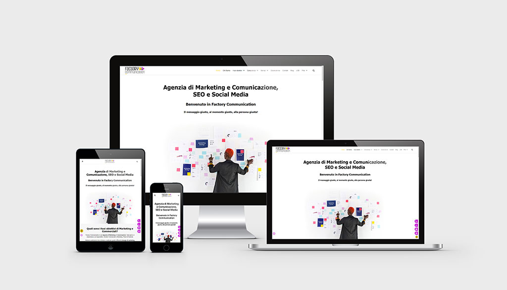
Example responsive site
If you want to see a practical example of responsive website development with custom graphics, simply browse our website on different devices.
Conclusions
Building responsive websites is essential for online success. By combining optimized design, well-organized structure, and targeted marketing strategies, you can create a website that not only attracts visitors, but converts them into customers.
Remember that the ultimate goal is to provide an exceptional user experience that encourages interaction and conversion, regardless of the device being used.
Don’t wait, contact our Team of Web Designers to request your free initial consultation on building your new responsive website.
Responsive site development FAQ
If you are looking for information inherent in making responsive sites, below you can find answers to some frequently asked questions.
A responsive website is designed to automatically adapt to different screen sizes and devices. Layout, images, and other elements resize and rearrange based on available space, ensuring a good user experience on desktops, tablets, and smartphones. It uses flexible CSS, scalable images and media queries to change the design according to device characteristics.
Having a responsive site is critical because:
– It improves the user experience on all devices
– It increases visibility on search engines, as Google rewards mobile-friendly sites
– It reduces maintenance costs compared to having separate desktop and mobile versions
– It allows you to reach more users, considering that more than 50 percent of web traffic comes from mobile devices.
To check if your site is responsive you can:
– Test it on several real devices (smartphones, tablets, desktops)
– Manually resize the browser window to see how it fits
– Use online tools such as Google’s Mobile-Friendly Test
– Check the source code for related media queries and CSS units.
The key elements of a responsive web design are:
– Flexible layout based on fluid grids
– Scalable images and media
– Use of media queries CSS
– Adaptive typography
– Navigation optimized for touch devices
– Performance optimized for fast loads.