


It often happens to hear an entrepreneur say, “We have redone the logo, now we have a new brand identity.” However, the logo is only a small part of a much larger system.
Brand identity is the set of visual, verbal, and strategic elements through which a company presents itself to the world: the way it looks, talks, behaves, and makes choices.
For an Italian SME, building a solid brand identity means deciding how to be recognizable, credible and desirable to its customers, collaborators and partners.
In this article we look in detail at what brand identity is, what elements make it up visually and strategically, how it is built through a professional process, and what mistakes to avoid.
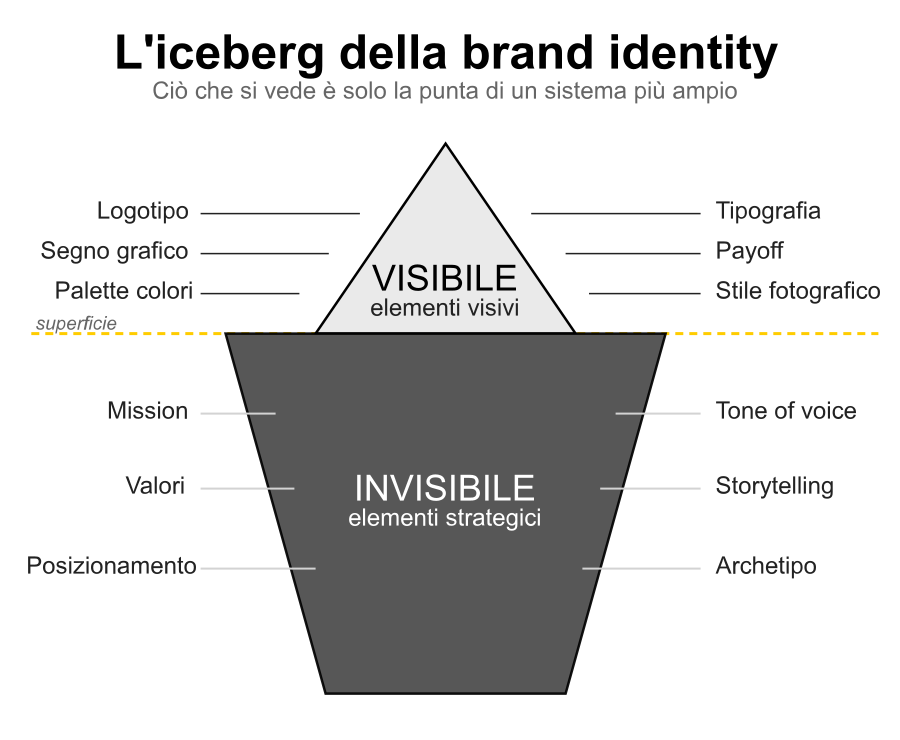
Fig. 1 – The iceberg of brand identity: visual elements are the visible part of a larger system
What is brand identity (and why it’s not just the logo)
Brand identity is the system of distinctive signs through which a company communicates who it is, what it does, and why it does it.
It includes tangible elements such as logotype, colors, typography, and photographic style, and intangible elements such as mission, values, and the voice with which the company speaks. Together, these elements form a coherent and recognizable identity.
A good metaphor is that of the person. A person has a face (the logo), a way of dressing (color palette and visual style), a way of speaking (tone of voice), a character (values), and a story (mission).
When these elements are consistent, we perceive an authentic person. When they are inconsistent, we perceive confusion. The same is true for a brand.
Brand, brand identity, brand image: three different things
The brand is the company as a whole, perceived by the market.
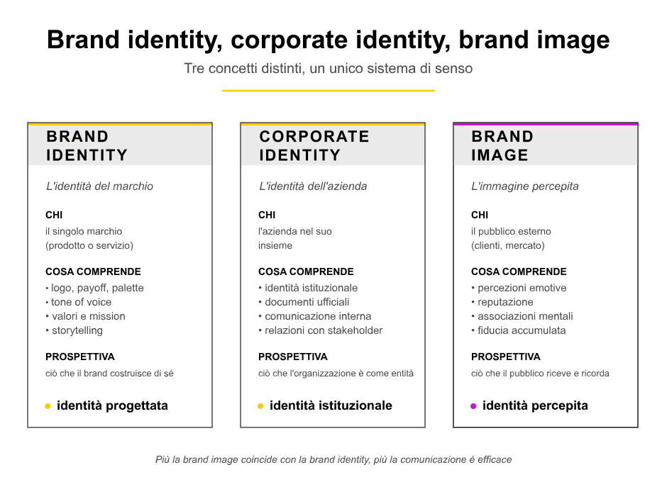
Brand identity is what the company does to define itself: it is the set of elements it intentionally constructs.
Brand image is what the public perceives: it can coincide with brand identity or differ, when internal communication does not reflect external reality or vice versa.
Why brand identity matters for SMEs
A well-constructed brand identity helps an SME stand out in crowded markets, justify a price positioning consistent with the value offered, attract like-minded employees, and build trust over time.
Italian SMEs that consciously invest in their identity gain a competitive advantage that withstands even market fluctuations.
Brand identity, corporate identity and brand image: three concepts, one system
Three terms circulate in Italian and international professional language that are often confused: brand identity, corporate identity and brand image.
Understanding the differences helps to set up branding projects more accurately.
Brand identity
It refers to brand identity understood as a product, service or business line.
It is the sign system that characterizes what the company offers to the market. The same company may have multiple brand identities, one for each brand in its portfolio.
Corporate identity
It refers to the identity of the company as a whole, as a legal and economic entity.
Includes visual identity applied to corporate documents, official channels, and institutional relations. Large companies have a corporate identity distinct from individual product brand identities.
Brand image
It is the public’s perception of the brand.
Brand identity is what the company builds; brand image is what the public receives, interprets and remembers. The strategic goal is to align the two dimensions as closely as possible: too much distance between designed identity and perceived image indicates a communication problem.

The visual elements that make up the brand identity
Visual elements are the most recognizable part of brand identity: what the audience sees before they read, hear or experience the brand.
Let’s look at them one by one with examples from the four sectors in which Factory Communication operates.
The logotype
The logotype is the textual part of the trademark: the company name written in specially chosen or designed typefaces.
Think of Coca-Cola, FedEx, Google: their logotype is the company name with a distinctive typographic treatment.
The logotype alone can function as a complete mark (we speak in this case of wordmark) or be accompanied by a graphic sign.
The graphic sign (or pictogram)
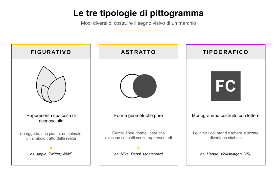
The graphic sign is the symbolic part of the brand: an image, an icon, an abstract or figurative symbol. Apple’s apple, Nike’s tick, Vodafone’s red circle are graphic signs.
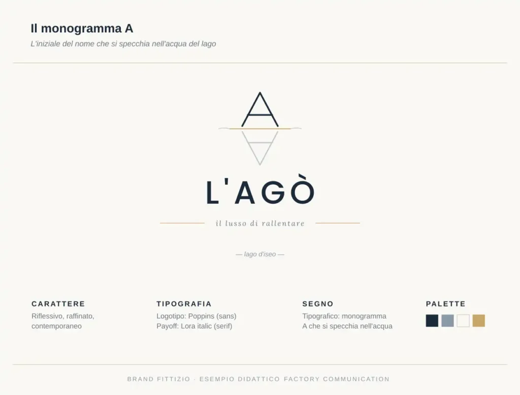
The pictogram can be figurative (representing something recognizable), abstract (pure geometric shapes) or typographic (a monogram constructed from the brand’s initials).
The brand
Trademark is the combination of logotype and graphic sign.
It is the most recognizable element of visual identity and the one that is generally legally registered to protect the brand.
There are three main configurations: combined trademark (separate sign and text), integrated trademark (sign and text merged into one form), modular trademark (multiple interchangeable versions for different uses).
The payoff (or claim)
The payoff is the short phrase that accompanies the brand and summarizes its promise of value. Nike’s “Just do it,” Apple’s “Think different,” and “L’Oréal, because you are worth it” are famous examples.
A good payoff is short, memorable, distinctive and consistent with brand positioning. For an SME, the payoff is a powerful tool for explaining in seconds what makes the company different.
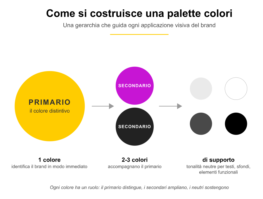
The color palette
Colors are the second most recognizable element after the logo.
A brand’s color palette is the official shade system that characterizes all visual communication. A well-designed palette distinguishes primary color, secondary colors, and supporting shades for text and backgrounds. Tiffany has built an entire imagery on its light blue, IKEA on yellow and blue, Ferrari on red.
Typography
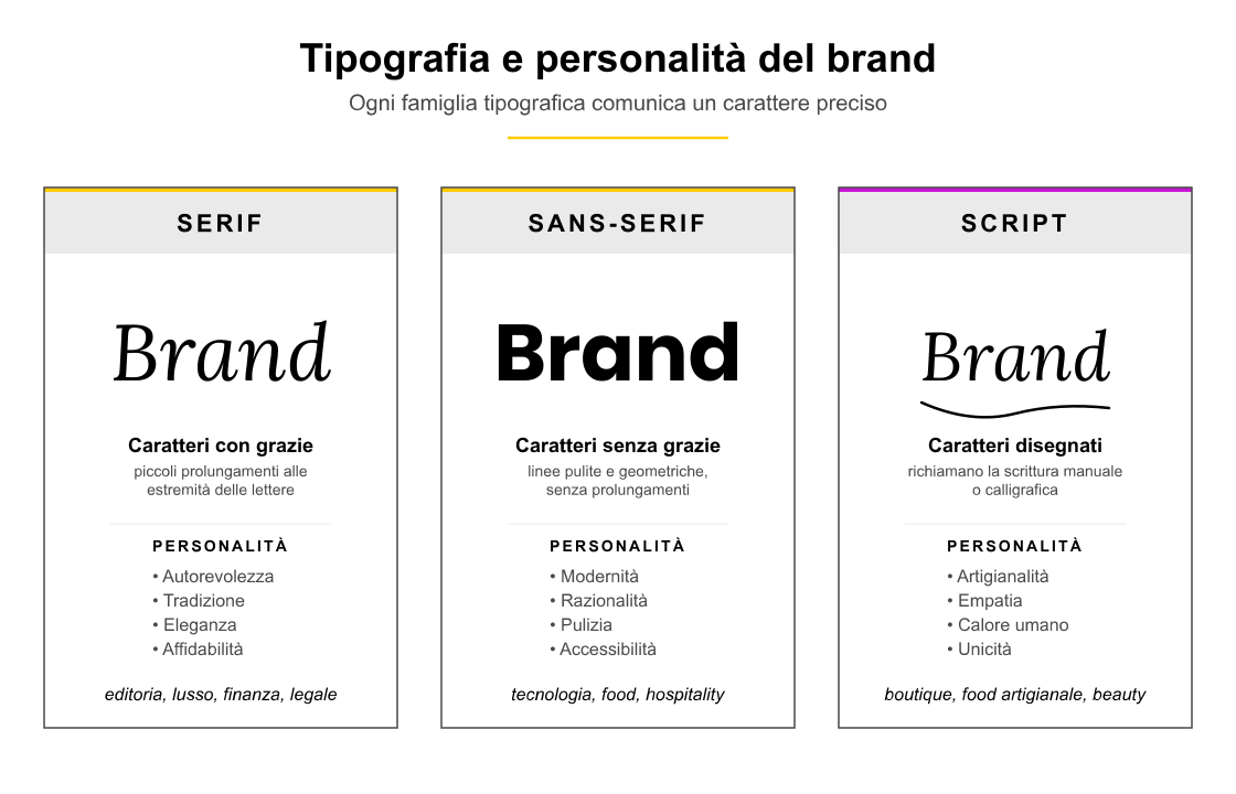
The typefaces chosen for the brand communicate personality.
A classic serif conveys authority and tradition; a geometric sans-serif conveys modernity and rationality; a hand-drawn typeface conveys craftsmanship and empathy.
A brand’s typographic system usually includes a headline font, a body text font, and sometimes an accessory font for graphic accents.
The photographic and iconographic style
The images chosen by the brand, the style of photographs, the treatment of colors, and the use of icons are an integral part of the visual identity.
A luxury brand prefers photographs with soft lighting and essential compositions; a food & beverage brand goes for saturated colors and close-up details; a financial brand chooses understated images and geometric compositions.
Brand versions
A professional brand always includes multiple versions for practical uses: positive version (on light background), negative version (on dark background), monochrome version, horizontal version, vertical version, reduced version for small formats.
These declinations are documented in a visual identity manual (brand manual) that ensures consistency in any application.
The invisible strategic elements (mission, values, voice)
Visual elements are the tip of the iceberg.
Beneath the surface are the strategic elements, that is, the system of meanings on which the whole identity rests.
Without these fundamentals, visual elements become form without substance and lose effectiveness in the medium term.
The mission statement
The mission is the reason the company exists, the promise it makes to the world, the difference it wants to create.
A clear mission guides all branding choices: the color palette, payoff, and photographic style descend from the mission, not vice versa.
For a family SME, the mission often reflects the values of the founder and the community in which the company is rooted.
Values
Values are the guiding principles that guide the company’s daily decisions.
Transparency, quality, sustainability, innovation, and care for the land are values that many Italian SMEs share.
However, what makes the difference is the consistency between stated values and actual behavior: a brand that declares sustainability and then ignores production waste weakens its credibility.
The tone of voice
Tone of voice is the way the brand speaks: the choice of words, the rhythm of sentences, the level of formality, the presence of humor or gravity.
A consistent tone of voice makes the brand recognizable even without the logo.
A financial advisor may choose an authoritative and reassuring tone; a food brand may choose a warm and convivial tone; a fashion brand may choose a sophisticated and laconic tone.
The story (brand storytelling)
Each brand has a story worth telling: the origin, the key steps, the people who made a difference, the difficulties overcome.
Storytelling transforms a company into a narrative subject with which the public can identify.
For Italian SMEs, history is often a valuable asset: family, territory, tradition, craft are narrative levers that work very well.
How to build an SME’s brand identity: the process
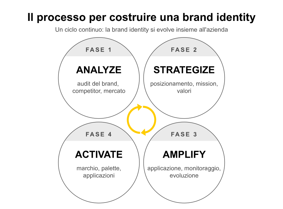
Building a professional brand identity requires method. Skipping steps or starting directly from the logo leads to superficial and short-lived results. The process we apply at Factory Communication consists of four steps, summarized in our Factory Strategy System.
Step 1 – Analyze
It starts with a thorough analysis of the company, market, competitors and audience.
One studies the history of the company, its strengths, its ambitions; one analyzes competing brands to identify spaces for differentiation; one listens to current and potential customers to understand how they perceive the brand. This phase is the most underestimated and the most decisive.
Phase 2 – Strategize
Based on the analysis, the strategic positioning, mission, values, tone of voice, and brand archetype are defined.
This stage produces a strategy document that guides all subsequent creative choices. Without strategy, creativity becomes decoration.
Step 3 – Activate
You enter the creative phase: designing the brand, color palette, typography, photographic style, and application declinations.
All visual elements are designed to be consistent with the strategy defined in the previous phase. The deliverable of this phase is the visual identity manual.
Step 4 – Amplify
Identity is applied on all touch points: website, social media, packaging, printed materials, signage, staff uniform.
Results are monitored, feedback is gathered, refinements are introduced. Brand identity is a living system that grows and evolves with the company.
Brand identity and ethical AI: Factory Communication’s point of view
In recent years, artificial intelligence has also transformed the world of branding.
There are tools that generate logos in seconds, automatic color palettes, instant mockups.
However, a company’s brand identity is more than a sum of aesthetic choices: it is the result of a deep understanding of who the company is, where it is going, what it represents to people.
At Factory Communication we use AI as an accelerator of professional work, not as a substitute for strategic thinking.
AI helps us explore more creative directions in less time, analyze large amounts of market data, and test variants more quickly.
Strategic decision-making, sense-making, and consistency with the entrepreneur’s values remain human work.
The most common mistakes in brand identity
In our daily work with Italian SMEs, we have identified some recurring mistakes that weaken the value of brand identity. Knowing them helps to avoid them.
Starting with the logo instead of the strategy
The most common mistake is asking a designer to design a new logo without first defining mission, values and positioning.
The result is almost always a logo that the owner likes, yet it does not work in the market because it does not reflect a clear strategy.
Imitating competitors
Studying competitors is about figuring out how to differentiate yourself, not copying them.
When too many companies in the same industry adopt similar styles, the market becomes indistinguishable and no one emerges.
Changing identity too often
Brand identity builds value over time through consistent repetition. Changing it every two or three years resets the accumulated recognition.
When a redesign is necessary, it should be done in an evolutionary way, preserving the most recognizable elements.
Neglect of daily application
A well-done visual identity manual is worth little if no one applies it consistently. Brand identity lives in the salesperson’s emails, social posts, business cards, and company interiors.
Daily consistency is what builds recognition.
In summary
Brand identity is a system of visual and strategic elements that allows a company to be recognizable, credible and desirable.
For Italian SMEs it is one of the investments with the best return in the medium term, provided you approach it methodically: first the strategy, then the visual elements, then the consistent application over time. A well-designed brand identity is not a cost, it is an asset that generates value every day.
Want to learn more about how to build your SME’s brand identity with a dedicated consulting path?
Discover Factory Communication’s Brand Identity & Corporate Identity service →